
Views & the Detail Panel
Cards for browsing, a list for hunting, a panel for the live page and your copies.
Three ways to see your library
| View | Best for |
|---|---|
| Cards ⌘1 | Big covers, title, domain and status. Zoom with ⌘+ / ⌘−. |
| List ⌘2 | Compact rows: thumbnail, title, domain, save date. |
| Headlines ⌘3 | Titles only. |
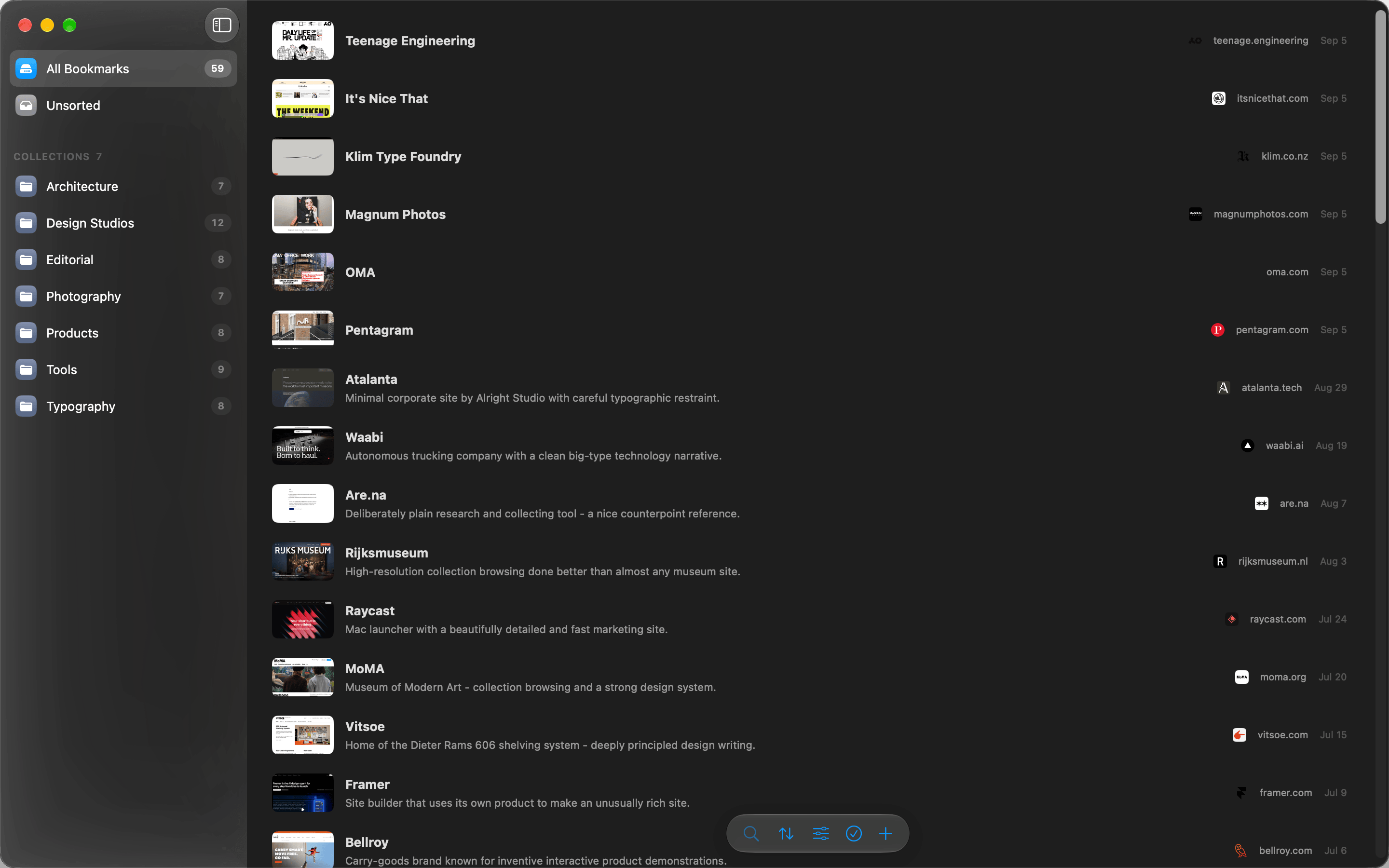

The detail panel
Open a bookmark with ↵ or a click. Three modes:
- Side panel: a resizable column next to the grid. Toggle with ⌘I, drag the edge to resize.
- Popover: a floating card over the grid.
- Full screen: reading on iPhone and iPad.
Web, Edit, Archive
Every mode has the same three tabs:
- Web: the live site, loaded fresh.
- Edit: title, URL, note and collection.
- Archive: your offline snapshots, every dated version. No internet needed.
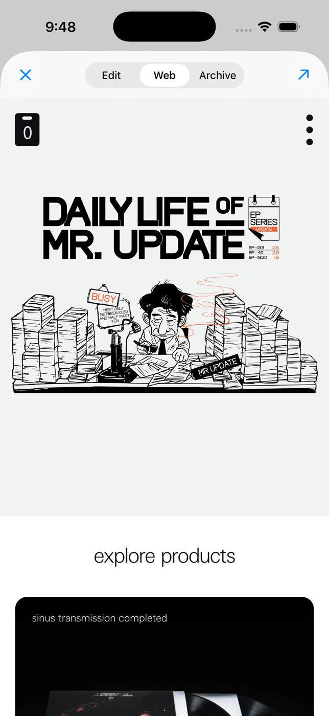
Web and Archive side by side: the page as it is today next to the page as you saved it.